
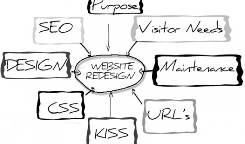
So how do you set about achieving a new design? Most people will take a look around at existing sites, especially those of their competitors or peers, and pick the bits they like best.
The resulting new design ends up being a mishmash of different concepts put together in an attempt to be the best in the industry or sector. This is all great except one critical thing has been forgotten, the user!
Considering the different types of users of the website and what they would be expecting from it, is critical to delivering a successful customer experience.
One way to ensure the customer is considered is to use user-centred design (UCD). UCD is a process which considers the requirements, expectations and skills of end users at each stage in the design process.
Getting your users to provide input into each step can help avoid rework, overruns and additional costs. This approach doesn’t have to discount the elements found during analysis of other web sites, it merely means that these are evaluated with the end user in mind.
Analysis of user needs will produce a list of functional and content elements for the new site. The next stage is to start considering the layout and basic functional design of the website. Developing wireframes at this point is a very useful visualisation tool.
The wireframes should consider how users will navigate the site, using the concept of user journeys can help to embellish the detail and quantity of wireframes. If you are planning on delivering to other devices such as mobiles or tablets now is a good time to look at this, rather than making it an afterthought.
Whilst agreeing wireframes, careful consideration should be given to content, and more specifically to the information architecture. This in its simplest form is the categorisation of content into a coherent structure, and most importantly, one which most people are going to understand quickly.
Many organisations make the mistake when organising their content to use internal structures and terminology. On a public website such content may not make sense to the average external user; however internally in an intranet environment it may be perfectly valid.
Information architecture leads naturally onto the design of navigation, bearing in mind that information architecture isn’t solely about a how the overall content is structured in terms of navigation – it is also about defining structured content including meta-data which may be utilised by features such as the site search.
Basic usability considerations should be employed when considering navigation including avoiding long lists of links – stick to five or six maximum – and users will be able to scan quickly for what they are looking for.
Breaking navigation into sub menus and context-sensitive navigation may help make this manageable on a large website.
By this stage you can finally start thinking about the graphic design bit, often the starting point for many sites, but hopefully not yours. You may want to start off with some simple aesthetics and do some user testing on your concepts, user journeys, information architecture and navigation before you go headlong into polishing a design, ideally this will be with real target users.
If you take that approach you will save yourself time when you get the dreaded feedback that something isn’t quite right and you need to start again.
Developing a prototype at this stage is advisable as users will find the tactility of a clickable (or indeed touchable in the case of tablet devices) site much more informative and rewarding than looking at a PowerPoint of what the website may look like.
Prototyping doesn’t need to be massively complicated, it only has to simulate functionality but it must be sufficiently developed to allow the important elements to be part of the test users’ experience.
After the feedback from your user testing you can finally apply the gloss to your design, taking care not to undo all the good work achieved up to this point.
Think carefully at this stage about accessibility in terms of colours, contrast and font sizes or you run the risk of alienating a portion of your audience, in some cases without even realising it.
Overall this approach, if taken seriously, will result in a better website than the cut and paste of design by competitor analysis.
We’re only skimming the surface here of UCD and the related concept of user journeys but it doesn’t need to be rocket science to end up with an attractive website that you can explain why it looks the way it does.
Critically, it should deliver even better results for the organisation.
And remember you’re not quite finished yet, as your website should continue to evolve through
user feedback gathered from commenting systems, ratings or a simple feedback form. User centred design is not just a process you undertake at the start of a project, you should never stop.
