In today’s world, websites are all about performance, not only in terms of page load time but also in terms of the ease with which users can locate the information they need.
A website that prioritises user experience (UX) can guide users to pertinent information with the fewest possible clicks while still offering a friendly ‘journey’ for the people visiting your website.
Your website strategy will determine if your digital marketing campaign succeeds or fails. Because of that, it’s essential to adhere to best practices for web design. Here are the do’s and don’ts of web design to help you create a user-friendly website.
Do: Use Minimal Colour Combinations
The colours on your website should represent your brand, complement the content, and entertain visitors visually. Avoid randomly selecting colours based on personal preference. Consider the brand and your customers rather than the competition. If you have a primary colour in mind but have no idea how to create colour schemes, an automated colour scheme generator will assist you in expanding your palette. An excellent WordPress web designer can also help you choose a suitable colour theme for your brand and make your website look more cohesive.
Don’t: Use Too Many Colours
An excess of colours can lead to an uncoordinated website design. Colours can have a significant psychological effect on how the audience perceives your brand. If you’re unsure about how many colours you should use, a good rule of thumb is to limit your design to no more than three. When working with a brand palette, a website will look more cohesive if the incorporated colours are well-balanced.
Do: Improve The Website’s Aesthetic Appeal
Since people think visually, images are compelling. You are free to incorporate images into your web design as long as they’re visually appealing, of a high resolution, and not pixelated. Ascertain that the images you choose represent the personality of your company. Don’t forget to incorporate textures and gradients into your design to improve its visual appeal.
Don’t: Use Over-The-Top Images
If your message involves too many graphics, it will become diluted, so use them sparingly and efficiently. Bear in mind that search engines have difficulty deciphering photographs, so avoid using them to express what you can with text. If you wish to use a background picture, keep its size to less than 1 MB. Large images will slow down your website’s loading speed.
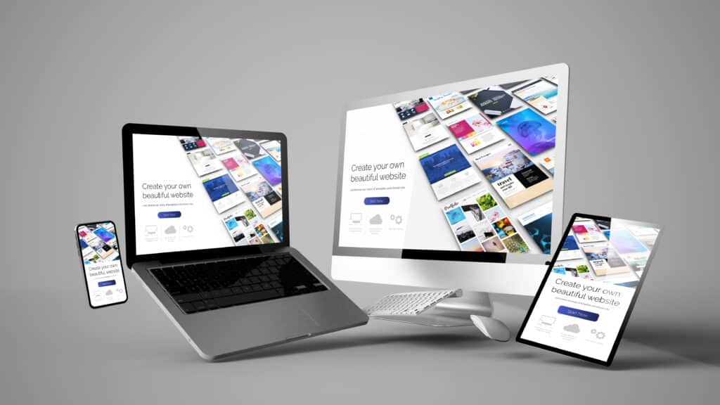
Do: Make Your Website Mobile-Friendly
The supreme quality is website responsiveness. With the official introduction of Google’s mobile-first indexing algorithm, having a good mobile presence is more important than ever. The foundation of effective user experience design is ensuring that users have a consistent experience across devices by providing them with the same content when possible. Additionally, it’s essential to make sure that elements look natural and function properly across various screen sizes. The simplest way to discover these issues is to get your hands dirty and test the webpage either on a phone or through the inspect tab in your browser.
Don’t: Make People Wait For Your Site To Load
Rapid page load times are becoming more critical as more people access websites via mobile devices. When anyone visits a website, they may not be connected to a superfast Wi-Fi network but rather 3G in the middle of nowhere. The speed of your website is influenced by many factors, including your hosting service, cache mechanisms, and file sizes. Utilising Google’s PageSpeed Insights tool, which provides recommendations on which optimisations to perform, is a simple way to conduct a site audit.
Do: Produce Concise But Engaging Material
Nowadays, nobody has the attention span necessary to read every word on a website. Individuals frequently rely on search engines or images and videos to guide them online. That’s why less is better when it comes to the text on websites. Your content should be bold and concise in conveying your message, with just enough bite to make an impression. Additionally, shorter content performs better on mobile devices, which have surpassed desktop computers in terms of market share. A website that communicates effectively with minimal copy is destined for success.
Don’t: Cram Websites With Advertisements And Banners
Although this isn’t valid for all websites, it’s a fair generalisation to follow. When users visit your website, they expect to see your content, not pop-up advertisements for items they’re not interested in. Similarly, if your website is an e-commerce site, avoid inundating visitors with advertisements that are more likely to irritate than assist.
Takeaway
If you follow these web design do’s and don’ts, your website will appear more professional, and you’ll have an easier time converting visitors into paying clients and customers. A thorough review would result in a visually appealing, user-friendly website that helps the company accomplish its objectives.
