As we also know, first impressions are the most important and if your virtual door is ugly, uninviting and more complicated to enter than Fort Knox, you’ve got a real problem on your hands.
When it comes to web design, the key question you should ask yourself at all times when you’re piecing together your landing page is: will it convert visitors into customers? The sole reason for building a landing page is to draw people in and give them enough reasons to keep on clicking.
With this in mind, we’ve compiled some top tips on how to design a landing page that not only looks great, but has more pulling power than an industrial-sized magnet.
Start from the Bottom
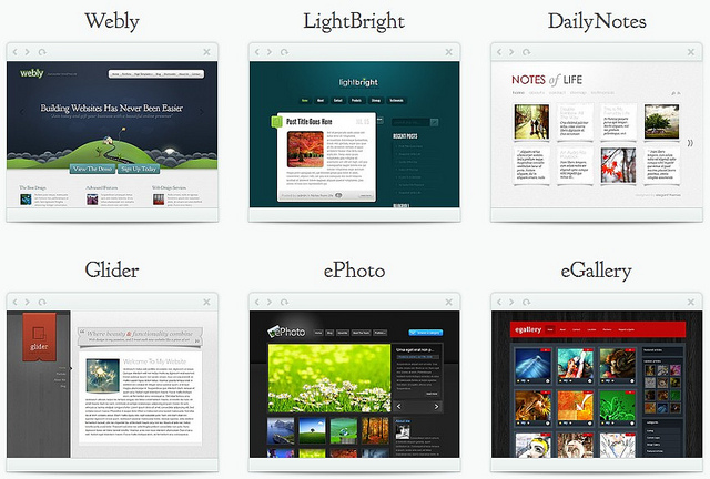
“Elegant Themes – Multimedia” (CC BY 2.0) by mazzwyn
One of the major problems small businesses often have when it comes to web design is cost. According to the Mud Blog, the average cost of a freelance web designer in 2014/2015 was £200 per day and of those surveyed, 20.5% had an average project value of £2,000 while 15.3% cost between £5,000 and £10,000.
Essentially, when it comes to building a website, it’s going to cost and if you’re a fledging business then it can be tempting to DIY it. Fortunately, in recent years, it’s become markedly easier to create your own website thanks to drag-and-drop services.
For example, the landing page creator by Active Trail not only lets you create a page without any coding knowledge, but each template is built around designs that are proven to convert. Using this strategy is not only simple, but it’s also cost-effective as it gives you expert knowledge for a fraction of the cost.
Be Concise Yet Detailed
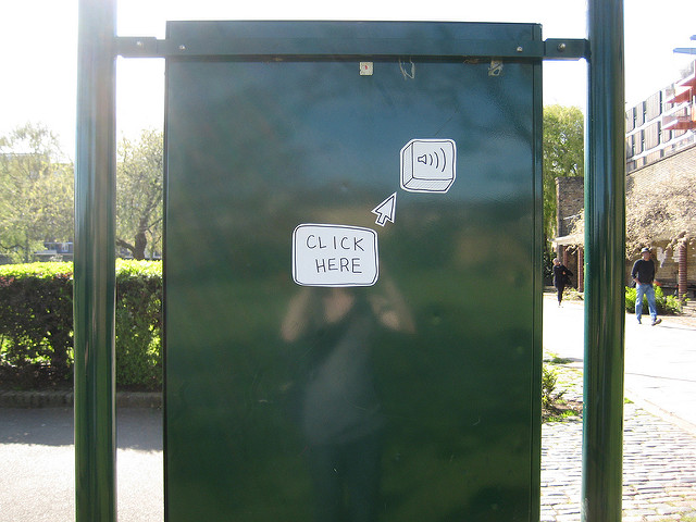
“Click here!” (CC BY 2.0) by wiredcanvas
It might seem like a contradiction of terms, but one of the best ways to convert visitors is to be as concise but detailed as possible. An example of how this is possible is by using a call-to-action (CTA) button in conjunction with a series of boxouts. This structure has the benefit of making the CTA as bold as possible while giving the page enough additional information to satisfy Google’s SEO rankings.
Indeed, by using a bold header and a highlighted button that says “click here” at the top of the landing page, a site can instantly capture people’s attention in the fewest words possible. However, while this is great for attention-grabbing, it doesn’t work so well for SEO purposes as it lacks the written content/information to make the page “valuable” in Google’s eyes.
Fortunately, you can get around this by combining images and detailed text inside boxouts. Placed at the bottom of the page (i.e. under the CTA button), these boxes are small enough to avoid detracting from the main message (i.e. “click here”), but bold enough to allow people to learn more about the site. Moreover, they should provide just enough SEO and information for search engines to crawl and, therefore, rank.
Do You Want to Join? Check!
“checked_tick” (CC BY 2.0) by o.tacke
Another sure-fire yet underrated way to convert visitors is the humble checkbox. While some web design gurus will say that this is just another unnecessary step that a customer won’t want to make, companies have found that the addition of one can improve conversion rates by 11%.
Placing a checkbox before a lengthy application form or survey essentially primes a user and pushes them into something that amounts to a subconscious contract. This small psychological trigger is often enough for them to feel committed and therefore follow through with whatever process you want them to do. The end result in this instance is more conversions and all it took was a simple little box.
Entering into the online arena as a small business can be a daunting task, especially if your website doesn’t generate sales as you’d want it to. Fortunately, there are multiple ways you can win customers and influence people. Whether that’s being direct about your message by designing a clear CTA or using a subtler tactic like the check boxes, converting more users is easy when you follow the steps we’ve outlined in this article.


