Discover a free app solution and the essentials you need to ensure that you create an experience that’s just right for your clients or customers.
We all know that we need to design a new site for mobile use and ease first, before translating it into desktop versions. Average web stats show that a substantially higher percentage of people access brand offers on their mobile device more so than any laptop or tablet.
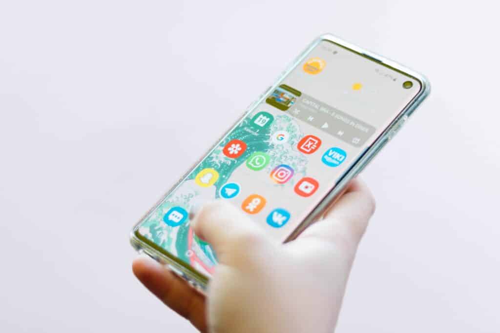
But what about apps? particularly during and post-covid we’re now seeing more businesses invest in them than ever. Why? Because it’s the only way that many businesses can still continue to function and offer a contactless service.
Now is the time to consider whether or not an app would benefit your customers – would it make their life, and in the long term, your life, easier to install one?
Before you stop reading thinking that this is only going to lead to a vast amount of expense. Keep going, we’ve got a free app solution for you that you can create over this coming weekend or in any of your spare time.
Step one to creating your own app
Download bubble.io. This is not an advertisement at all. I’ve interviewed a number of different startup founder’s in my time who have created fantastic apps through this codeless (yes you read that right, no coding involved) system. Bubble’s interface is easy to use so you can get started and very quickly create a framework for your business. Not sure what your clients would want? Ask them – whizz out an email to your network and see what shortcuts they’d appreciate. Apps are all about making your business easier to make sales or contacts. As your business develops you can update the app. Bubble is a ‘freemium’ service which means that you can sign up and use a certain amount of their services for free and pay a monthly/annual fee to access more features. Your list of app needs is crucial in defining how much you spend – do you want to take payments over the app? Schedule appointments, turn on instant messaging, send offers and news to your app owners? The choice is yours …
Aimée-Louise Carton, co-founder and CEO of KeepAppy, has taken the time to chat to Business Matters about the key elements to consider when designing a new app. Read and apply as you will …
Top List of Essentials for Usability:
- Three Click Rule – users will rarely make more three clicks / taps / swipes to reach a feature before they become frustrated by how hard it is to find what they are looking for.
- Colours 1 – Most people learn to read with dark text on white background, too much colours or white text on dark background actually causes the user to read more slowly
- Colours 2 – humans are very simple, we rely on colours we already know. The most common colours we interact with are the ones we see every day – traffic lights. Consequently, humans associate green with movement … and vegetables, so nice and healthy. While red is a colour of warning – stop and blood. Look closely at colour combinations – conflicting colours will make users uncomfortable and less likely to use product, while neutral tones with blasts of branded colour, like you see on Facebook for example, will increase brand association
- Physical design – Think about the physical aspects as well – very simply, at what point does it become cumbersome for the thumb finger to reach the top of the screen? How often would a user be willing to move their hands to touch the top of the screen?
- A clear understanding of your user is the most underrated yet important aspect of any app build. Look at your Google analytics for your website to find out where your customers are coming to you from – do they prefer iOS over Android? If so, how can you integrate iOS design to increase intuitiveness and understanding of usability? Focusing on what the user has already proven to know and like can increase usability because they will feel more positive towards what they already know.
- Fun! Most people have a competitive streak and competition hacks can really increase the users engagement with an app. For example, Tinder offered the ‘streak’ component (ie. logging in every day), while FitBit awards users with ‘badges’ based on steps achieved. Creating these competitive components can really help
- Tone / voice – what kind of voice will your brand take? Peer to peer or top down lecturing? A peer to peer voice will help people feel more comfortable using a more causal app (eg. Bumble), while medical or professional apps should imitate the voice of authority to help people feel safe / protected (eg. fitness apps)