

Marketing using visuals, such as banners, posters, smart TVs, and other forms of digital displays, as well as your website, are vital ingredients in the success of your campaign.
Without great visuals, your campaign would likely fall by the wayside, especially now that we seem to be living in an age that focuses more on visuals than anything else. Take a look at the following design tips to improve your marketing:
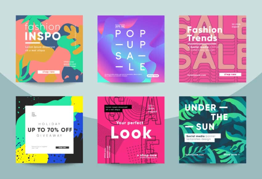
Use The Power Of Colors
Play with colors to improve your marketing visuals as it’s one of the most important things in any advertising campaign. Implementing proper color combination can be accomplished using a reliable graphic design software.
Keep in mind that when you’re advertising a product, it’s not enough just to have your ad listed on the product itself. It’s essential that the colors used will be able to catch the attention of buyers. Otherwise, there’s a chance that the consumer would not even notice that your product exists. That said, you’ll want to consider the different types of colors that will be able to help you accomplish this goal.
Take a look at the following tips when using the power of colors to create great visuals for your marketing campaign:
- Think about how the colors are going to affect the way your company and your products look. For example, green is a perfect hue for health and cleaning products, while blue is often used for business or communication.
- Saturated colors are intense and brilliant, while dull colors are desaturated. Use the right saturation of colors to help you create a good marketing campaign, such as your social media visuals. Combining intense and pale colors together increases the aesthetic appeal and effect of both colors.
- Make sure that the colors you use are aligned with your brand. While you will find that there are some you can work with, there are also others that might not look very nice when they are used in conjunction with your products or your business. The three primary colors include blue, red, and yellow, which are dramatic and very bright. These colors are often used in creating food brand logos.
Use The Right Typography
Typography also contributes to the success of your marketing design. When your designs are visually appealing and easy to read, people will be encouraged to buy more of your products and continue patronizing your brand. In some cases, having an effective marketing design is even more valuable than having a high-quality product itself.
Some things to remember about choosing the right typography:
- Choose Legible Fonts: Pick fonts that are easy to read and are not too fancy. Depending on the message you want to convey or highlight in your marketing materials, you can choose bold fonts or narrow fonts, as well as serif and sans serif fonts. Try to avoid cursive fonts or fonts that are too fancy as they may be hard to understand, especially in smaller marketing materials.
- Compare Fonts And Choose What Feels Right: After narrowing down your options, creating a printed or on-screen menu card is recommended to compare all typefaces. In this way, you can choose the best typography for your marketing campaign or website.
Use A Reliable Design Tool
Improve your marketing visuals by using tools like Canva or alternatives that are as reliable. Doing this will allow you to take advantage of a user-friendly program that can help you create the graphics you need for your marketing materials.
Take a look at the good reasons why you should use design tools to create your marketing visuals:
- You can easily create various visual content such as presentations, infographics, invitations, posters, documents, social media graphics, and others.
- Get helpful templates that users can easily learn how to use.
- Graphic design experience is often not necessary when using these tools.
Make Your Marketing Visuals Diverse
Making your visuals diverse means using different formats and displays to promote your brand so they appear more interesting and interactive. With different formats, not only do you have a wide array of media in which you can publish these materials, but you can also have a wider audience reach.
Take a look at the following examples of diverse marketing visuals:
- Promotional materials
- Digital displays
- Infographics
- Carousel images for social media marketing
- Expressive images
- Animation for your video marketing
Use Visuals In Your Blog
If you’re using your website or blog to market your products or services, be sure to use visual content and not just text. This type of blogging is an extremely effective way to get people to visit your site and make them want to buy something in your online store. But you don’t want to just slap a blog with some pictures.
You need to learn how to get the right balance of text and images so that you can really get the most out of this type of blogging. For instance, including at least two to three images is ideal for a 1,000-word count article.
Invest In A High-Quality Camera
You can improve your marketing visuals by using high-quality camera. For example, when you are listing a product, your customers need to see how exactly the product looks like even when they are just viewing your listing. A high-quality camera will ensure that the true color, shape, and angles of the product are captured in high-definition.
Make Your Marketing Visuals Engaging
Creating engaging marketing visuals or visual content is not that complicated as it may seem. Here’s how you can do it:
- Create Educational Or Explainer Videos: You can make an educational or explainer video about something important, like a new product feature, such as an added safety feature for a home security product you’re endorsing. Whatever your reason for making this type of video, the key is to capture your audience’s attention.
- Incorporate Animation: Whether you are using a digital smart TV display in front of your brick-and-mortar store or in your website, you can incorporate animation to catch the attention of your audience, most especially if you target younger people.
Use Whitespace
There are many ways to improve your marketing visuals, such as your website, banners, or posters, one of which is using whitespace to your advantage. Whitespace, also known as negative space or blank space, is the space between text, images, and graphics. Aside from making images pop out, it can also give your eyes a breather. This can be especially advantageous to web pages displaying products.
Check the following tips when using whitespace:
- Avoid Large Or Too Many Images And Graphics: While images and graphics may be a good idea for some, overdoing this can make a page, poster, or banner look cluttered. Use fewer images and graphics and balance them out with the whitespace by minimizing their size.
- Provide Room For Your Eyes To Breathe: If your images and graphics are too busy, not only would they fail to stand out to visitors since they won’t know where to look, but these will also cause eye strain. So, whether you’re designing a website ad, TV ad display, poster, or flyer, make sure to use padding, space out letters, and remove borders.
Use A Good Product Background
In product photography, it’s important to keep the background simple to ensure that the product won’t be missed in the shot. Highlight your product by using a white background, creating clean and crisp product photos.
Strike A Good Balance Between Graphic Design Elements
Achieving a balance in graphic design is one of the most important principles you must adhere to. Graphic design consists of elements like lines, typography, colors, layout, shapes, and volume. A proper combination of these elements attracts the attention of consumers, effectively presenting information so they will easily understand what they’re looking at.
Check the following graphic design tips to strike a perfect balance between different design elements:
- Lines: Lines have different properties, allowing you to convey a broad range of expressions. Lines can be thin or thick, curved or straight, geometric, or organic (drawn by hand). For instance, you can create uniqueness in your clothing products by using your celebrity endorser’s hand signature to capture your audience’s attention.
- Shapes: Shapes are vital elements that designers use for effective communication. For example, a heart-shaped object symbolizes love and charity.
- Volume: This applies to three-dimensional visuals with length, width, and depth. It’s a good idea to step up from two-dimensional graphics and utilize 3D graphics in your next marketing campaign.
Conclusion
When you’re looking for ways to improve your visuals, you can apply the tips discussed above, such as taking advantage of the power of colors, using proper typography, and utilizing white or negative space, among others. Regardless of the materials you use for your marketing campaigns, keep in mind that great visuals will always have a certain impact and can effectively grab your audience’s attention better compared to materials that simply have pictures or text posted on them, but don’t apply the appropriate design elements.


